Often we come across with situations, where the data we summarize in Pivot table do not give the right picture or not giving all the necessary perspectives of the data. Take the example of the following. Here, the sample data captures month-wise Sales and Profit figures for two items - Dry Fruits and Fresh Fruits. The data is for 2018 and 2019
We would like to summarize the data so that we know the following:
- What is the volume sale for both item types, Year -wise and month wise
- If we look a item like Dry Fruits, how much percentage of sales each month contributed throughout the year? - seasonal sales percentage
- Each month what is sales percentage of Item types
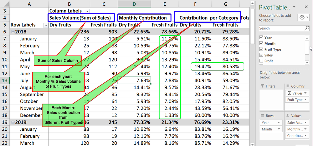
Please refer to the Picture below. We will walk through to do summarization of Sales figures in different ways to create different perspectives and build the Pivot like the example below
We will walk you through a step-by-step process. Let us begin with a sample file.
You can download it here: Data for Pivot table Multi Summarization
First step is to create the Pivot table and add the first summarization.
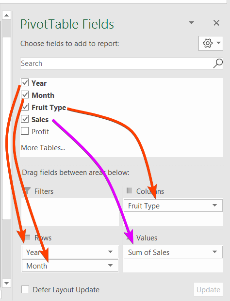
- We do it by dragging Year Field to the rows.
- Then drag Month to rows, but below Year.
- Drag FruitTypes to the columns and finally
- Sales to Values
Following Picture explains the same
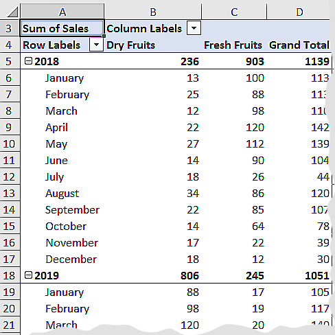
This will produce the Pivot Table like the following
Let us create the next summarization of the same field . For this to happen, we drag the Sales to the value window. In this example we will create one more summarization using the same field. So, Let us repeat the previous step to drag the field to the Value window. Please see the example below
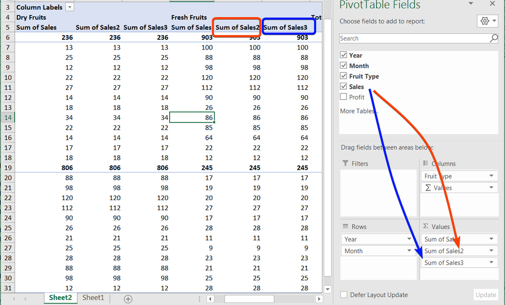
As you can see the subsequent summarization is showing the same data in the Pivot. We want to change it to show other summarization, like what does the sales figure tells us? What percentage of sales the monthly sales contributed to the yearly Sales volume. This can be done by changing the value Field settings of the summarization. Let us do it step by Step
- Use the dropdown on the "Sum of Sales2" and
- Select Value Field Settings
- In the Value Field Setting window, select Show Values As
- In the drop-down, there are multiple options. You choose what you want to see there. In this example I have chosen % of Parent Row Total. If you notice the data in the Pivot example, each row represents monthly sales. And these are organised per year; like sales each month in 2018 and 2019. So, parent is Year in this case. when I choose % of Parent Row Total, it shows the monthly data as % of total sales of that year
- Click OK to complete this. Please note that you can change the Heading of the Summarization in this step and is explained in the picture below. In the First Picture example, we have changed it to Monthly Contribution.
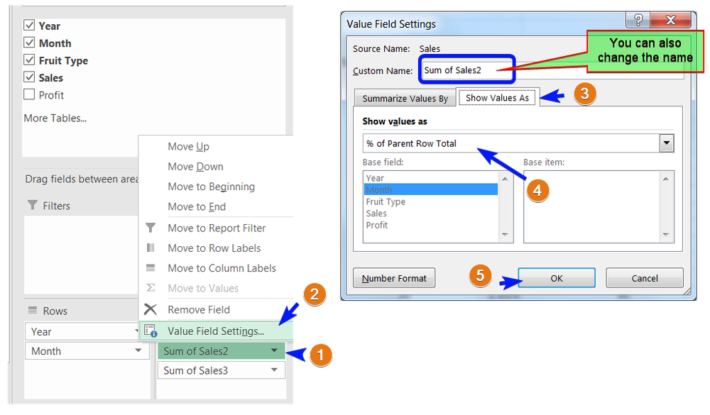
Each row in the example have Sales of Dry Fruits and Fresh Fruits. If we want to see how each of these category are performing against each other, we can use % of Row Total as Show values as. In fact in the To be scenario example at the Top, we used the third Summarization Field (Sum of Sales3). renamed it to Contribution per Category. and we changed the Show values as to % of Row Total
I Hope this tutorial has helped you to add more summarizations. You may further explore on what the other calculation options and their effects. In future article, I will show how we can create a new Summarization out of nowhere but based on calculations done on different rows or columns