
Analyzing stock returns is a crucial aspect of financial analysis and investment decision-making. Investors and analysts often compare the performance of different stocks to make informed investment choices. Python, with its powerful data manipulation library called Pandas, provides a convenient and efficient way to analyze and compare stock returns. In this article, we will explore how to use Pandas to perform stock return comparison, enabling you to gain valuable insights into the performance of different stocks.
These would be covered in the following sections:
Background
When it is time for DIY for quick analysis and flexibility, first thing comes up in mind is python and pandas. pandas is a open source library to work with relational or labeled data sets. There are different sources to retrieve historical Stock or Mutual funds data. One of the best source is Yahoo Finance. They have the repository of worldwide data.
Retrieving Stock Data
To begin, we need to retrieve the historical price data for the stocks we want to analyze. We can accomplish this by using various data sources, such as financial APIs or CSV files. Pandas provides several methods to read and load data into a DataFrame, making it easy to handle and manipulate. In this article, we will use Yahoo Finance Data. I will use yfinance library to fetch data from Yahoo Finance. Please refer to the legal disclaimer at https://github.com/ranaroussi/yfinance before using the library
You can install by the following in Windows.
C:\Users>pip install yfinance
Lets start by importing all the libraries that will be used. we do not need to import pandas explicitly as it is already done by yfinance
import yfinance as yf
import matplotlib.pyplot as plt
We need to use Symbols from Yahoo finance for which stock or Mutual funds we want to compare. lets take these data from users and store it in variables. Similarly, we also need a date range for which we collect the data from Yahoo.
We get data calling download function of yfinance. In this example, we are only using the closing prices ( 'Adj Close' )of the stock on daily basis
scheme_input = input("Please type Yahoo code for stock or Mutual funds separated by space :")

scheme_list = scheme_input.strip().split()

daterange = input('Start date and end date separated by space in yyyy-mm-dd format :')

start, end = daterange.strip().split()

alldata = yf.download(scheme_list,start, end)['Adj Close']
Lets try with some data by running the python file
Please type Yahoo code for stock or Mutual funds separated by space :^NSEI 0P0000MLHH.BO 0P0000WCFZ.BO 0P0000TDG8.BO 0P00011MAV.BO 0P0000XV9V.BO
Start date and end date separated by space in yyyy-mm-dd format :2021-05-01 2023-05-01
Here are few rows from header which alldata dataframe now have:
| 0P0000MLHH.BO | 0P0000TDG8.BO | 0P0000WCFZ.BO | 0P0000XV9V.BO | 0P00011MAV.BO | ^NSEI | |
|---|---|---|---|---|---|---|
| Date | ||||||
| 2021-05-03 | 38.840000 | 55.340000 | 38.200001 | 86.327003 | 46.029999 | 14634.150391 |
| 2021-05-04 | 38.520000 | 54.950001 | 37.970001 | 85.871002 | 46.099998 | 14496.500000 |
| 2021-05-05 | 38.799999 | 55.459999 | 38.259998 | 86.879997 | 46.580002 | 14617.849609 |
| 2021-05-06 | 39.070000 | 56.049999 | 38.490002 | 87.575996 | 46.970001 | 14724.799805 |
| 2021-05-07 | 39.230000 | 55.720001 | 38.650002 | 87.767998 | 46.950001 | 14823.150391 |
Lets move on to the next section to prepare the data for visualization
Calculating Stock Returns
Now we have the daily close prices for the stocks for the period that we have defined. We cannot use the data as is to create a line graph. we need to create a new data from from this is one which will have the values of Percentage change by using pct_change() function of pandas. this returns a new data frame of same size each data is percentage change from previous value +1
all_data = (alldata.pct_change()+1)
But to plot the data we need the final value after the percentage change. Here we will use another pandas function The cumprod(). The function calculates the cumulative product of values in a DataFrame or Series. It returns a new DataFrame or Series with the same shape as the input object, where each element is the cumulative product of all preceding elements in the original object. In our case when we apply on the percentage change it will give us the final figure that we can plot
final_data = all_data.cumprod()
in fact we can combine bothe the functions to gether to get the final data frame like the following
final_data = (alldata.pct_change()+1).cumprod()
Lets see how the data looks like:
| 0P0000MLHH.BO | 0P0000TDG8.BO | 0P0000WCFZ.BO | 0P0000XV9V.BO | 0P00011MAV.BO | ^NSEI | |
|---|---|---|---|---|---|---|
| Date | ||||||
| 2021-05-03 | NaN | NaN | NaN | NaN | NaN | NaN |
| 2021-05-04 | 0.991761 | 0.992953 | 0.993979 | 0.994718 | 1.001521 | 0.990594 |
| 2021-05-05 | 0.998970 | 1.002168 | 1.001571 | 1.006406 | 1.011949 | 0.998886 |
| 2021-05-06 | 1.005922 | 1.012830 | 1.007592 | 1.014468 | 1.020422 | 1.006194 |
| 2021-05-07 | 1.010041 | 1.006867 | 1.011780 | 1.016692 | 1.019987 | 1.012915 |
The data looks good. But you probably also agree that having the symbol names in the graph is not too nice. It should be with the well known names instead of symbols. Lets do that. We will use yfinance module to help us out here
for col in final_data.columns:
    final_data.rename(columns={col: yf.Ticker(col).info['shortName']}, inplace=True)
And the result is this
| Axis Bluechip Fund Growth | Axis Midcap Fund Growth | Axis Focused 25 Fund Growth | Mirae Asset Emerging Bluechip F | Axis Small Cap Fund Regular Gro | NIFTY 50 | |
|---|---|---|---|---|---|---|
| Date | ||||||
| 2021-05-03 | NaN | NaN | NaN | NaN | NaN | NaN |
| 2021-05-04 | 0.991761 | 0.992953 | 0.993979 | 0.994718 | 1.001521 | 0.990594 |
| 2021-05-05 | 0.998970 | 1.002168 | 1.001571 | 1.006406 | 1.011949 | 0.998886 |
| 2021-05-06 | 1.005922 | 1.012830 | 1.007592 | 1.014468 | 1.020422 | 1.006194 |
| 2021-05-07 | 1.010041 | 1.006867 | 1.011780 | 1.016692 | 1.019987 | 1.012915 |
Looks good. now lets plot it
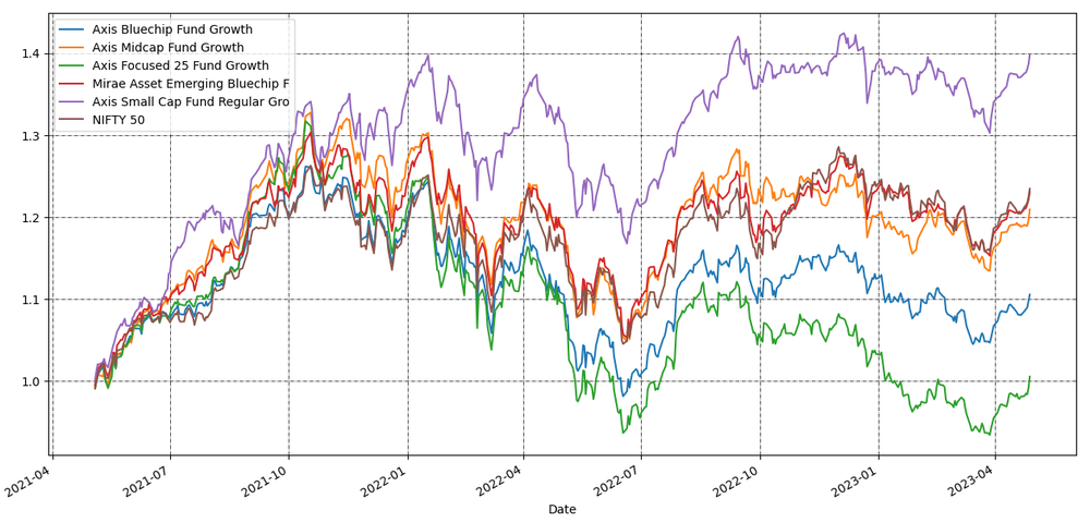
Visualizing Stock Returns
We will use simple plot function of pandas. This uses matplotlib internally. to make the graph nice, lets add legends and grid lines using matplotlib functions
final_data.plot()

plt.legend()

plt.grid(which="major", color='k', linestyle='-.', linewidth=0.5)
plt.show()
Here is the result :
This was a quick chart. Hope this will help to create more complex graphs and analysis.